Friday 27 January 2012


Most days i check out what Design Milk have uploaded. I follow them on Twitter and Facebook, so I see most things that they do. I like to know whats happening all around the world, and I think this company is brilliant for keeping you up to date, especially in the kind of environment I want to have a career in. Not only does it show you new buildings and designs but they advertise different companies like Ligne Roset which I think is amazing and have just ordered their current brochure. 

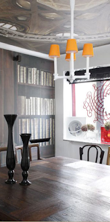
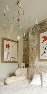
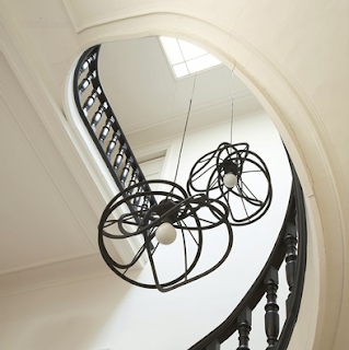
Above are some of the products shown on Design Milk and some of the things they advertise.

Here are a few of my favourite pieces from the website which I have found via Facebook, Twitter and going on the webiste....

MYRA VALE HOUSE BY KATON REDGEN MATHIESON


This is a fabulous piece of architecture in New South Wales, Australia. It was designed by Katon Redgen Mathieson. It has  floor to ceiling windows to give a feeling of inside out, and looks over the beautiful green views. 

ATRIUM HOUSE BY MESH ARCHITECTURES


This is another house i found when looking on the Facebook page. The inside is absolutely beautiful, its very industrial and modern and it also gives a feeling of inside-out, and has lots of glass to let the light in, but at the same time is very private for the owner. Its contemporary and I think a lot of contemporary homes don't really feel homely, whereas I think this one does. It was designed by MESH Architectures and is located in Brooklyn NYC.

ROUNDED LOFT BY A1 ARCHITECTS


This is a loft conversion, with the most brilliant idea of storage space with a clean, cut, warm feel. I love the wood look and the stainless steel netting is just something else. It was designed by A1 Architects and is Located in Prague, Czech Republic.


The Maria S.C. lamp

I'm totally in love with this design. I just think the idea is so fascinating and it looks really cool. Its actually made from chemistry test tubes and it was inspired by scientist Maria Sklodowska-Curie. She was awarded a Noble Prize in chemistry for the discovery of polonium and radium. Not only can you keep it plain and simple but you can add colour by adding liquids inside. So whichever mood you're in you could change the colour! How amazing.


http://design-milk.com/maria-s-c-lamp-by-pani-jurek/#more-92437


Monday 16 January 2012


Here is a photo of the Baltic. Its a beautiful building and I love the old and new mix it has. The glass extension works really well, especially over looking the river tyne and the buildings up to Newcastle. This time i went they were busy taking down the Turner Prize, so there wasn't much exhibition space on show. One exhibition that was on was the.. 

MIKE KELLEY & MICHAEL SMITH 
20 October 2011 - 15 January 2012
A Voyage of Growth and Discovery

'The UK premiere of a major collaborative installation between renowned American artists Mike Kelley and Michael Smith. A Voyage of Growth and Discovery sees the man-child Baby IKKI, a character developed by Smith for over thirty years, navigate the infamous Burning Man festival in the Nevada desert. Alone in his journey amongst thousands of revellers, IKKI negotiates the primal elements of fire, water, earth and wind. A six-channel video installation replaying IKKI’s 'voyage' is enveloped by a fantasy environment evoking that of the festival. At its centre stands a 30ft incarnation of IKKI himself.'


I just didn't understand the process and why there was a man dressed as a baby. I found it quite creepy, with the music and films playing on the screens. There wasn't many people walking around either!-Not my cup of tea.  


URBAN OUTFITTERS is the best shop in the world!

My first experience in the shop was in the Edinburgh store and straight away I fell in love with not just the clothes but the interior also. Its so industrial, retro, just so cool and quirky. I was so excited to hear that their was a store opening in Newcastle. (All my money is spent their!) Here is some photographs of the store being made and how it looks now...


The space looks so open and light. I love the RSJ which gives a real industrial feel. The exposed breeze blocks and brick around the store look superb!


This is the 2nd set of stairs up to the 3rd floor. The steel staircase is just fantastic, I especially like the sharp curves and wood hand rail, against the mesh and glass. All the quirky accessories really pull together the whole feel of the shop. Old and new.


This is one of the tables dressed with the clothes and accessories. Its so interesting and its makes you just want to pick everything up and buy it. It has been really thought about and makes it easier for everyone to enjoy their shopping experience.


On the right hand side of this photograph you can see a lift. Again this is industrial and reminds me of the Charlie and the Chocolate factory glass elevator.  This is made out of steel beams and glass, and its against the exposed walls of brick and concrete. That modern and old feel really works. 
The light fitting you can also see here is totally random and exciting. You notice it straight away when you enter the shop, I've never seen anything like it before its very individual, like most of the furniture and displays in the shop. 


This is the mens department on the 3rd floor. Again there is lots of tables set out with the clothes folded up, which I think makes the shopping experience more exciting and you want to buy everything on display. At the back of this photograph you can see the old windows which are huge! and look fantastic, again old mixed with new.

I have noticed from doing research and actually viewing the stores that they are all different and have bespoke pieces in them. The designs and layout are all quite similar but as the quote below says they are all customized to suit each environment. 
Here is the website for the company who design and create these bespoke pieces especially for Urban Outfitters.


Urban Outfitters
"Founded in 1970, Urban Outfitters operates more than 130 stores in the United States, Canada and Europe, all offering an eclectic mix of merchandise. We stock our stores with what we love, calling on our — and our customer's — interest in contemporary art, music and fashion. From men's & women's apparel and accessories to items for the apartment, we offer a lifestyle-specific shopping experience for the educated, urban-minded individual in the 18 to 30 year-old range — both online and in our stores as well as through our catalog."

Tuesday 10 January 2012

Last week I visited the Baltic in Gateshead to have a look at the Turner Prize. I heard mixed words about it, so had an open mind myself. Something that caught my eye was the Martin Boyce installation. His work was very sculptured, with lots of metal, wood and engraved pieces. I could see other things you could create out of his work and have found some examples which he has already done himself and I actually think they are beautiful.


This was the first thing I noticed when I walked into the room. I love the intricate detail. They were positioned as if they were air vents but i didnt actually realised until I did some research and they're actually Ventilation Grills for a house in the wood.


This is what i meant by creating something similar with Martin Boyce' designs. Mesh, detailed, metal structured light shades. These would look fantastic in a garden area, they have a very industrial feel to them and I love the colours.


The patterns he creates seem to repeat in various things he designs. This stone floor with gold metal separators look absolutely beautiful. Not everyone can see that his designs are different, unusual and very unique.


Here is another pattern very similar as above. This kind of design could be used for curtain material, cushions, bedding, blinds, art work a number of things. Plain and simple with a retro feel, something I love.


This was the actual installation in the Baltic. I noticed some people didn't understand, and looked quite confused at how this is art, but once to start thinking of things and get your imagination head on, its quite wonderful.
Making of montage de l'appart IKEA


This video is really inspiring. It's such a great idea and a great promotional idea for the company, Ikea. As you can see when you watch the video, hundreds..thousands of people are walking past each day, so this is definitely creating some interest in whats going on and the about the brand. 

This is such a cool idea, it's from Design Milk. a website I often like to view and see whats new! I think something like this would look brilliant in an office or a 'geeks' room. There very unusual and won't be everyone's cup of tea, but I know lots of 'arty' people would love them. I think they would look great in different colours aswell.

Thursday 5 January 2012


'Half rough, half luxury. A little bit of luxury in a rough part of London. A little bit of rough in a luxurious London.'

Rouge Luxe is a small Grade II listed building/hotel in London. It's so unique and interesting and looks very luxury. Its was designed by Rabih Hage. I really want to stay sometime. It reminds me of somewhere where you could go and be anywhere in the world. 'The style of the hotel is a mix of old and new, furniture and art; combining colours and beautiful fabrics with cheap materials and using the existing distressed walls.'


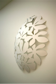
I think this is a great idea and a statement piece of wall art. Its such a simple idea and yet works so well. I like the way it buldges out of the wall but also in a kind of disguised way. It's from the website Ikea Hackers, have a look on their website as there is some funny, original ideas.


This is the most fantastic staircase I have ever seen! Visually it looks amazing and the idea that its floating is brilliant. The colours are so simple and the materials used is sleek. It has definitely been designed for this particular house and it wouldn't look the same in just any house. But its given me a lot of inspiration. 

It's from The Cool Hunter website. I often follow whats been updated, looking at things from whats in the news, to architecture, to design, to lifestyle. It's slogan is 
'ROAMING THE UK AND THE GLOBE, SO YOU'RE IN THE KNOW.' 
which I think is brilliant. (It does what it says on the tin!)


I found out about Ligne Roset when doing some research for a past project. I think their style and designs are unique and its right up my street. Its got a retro feel, with contemporary, old and modern mixed together, which I love. This is one of my favorite lighting designs, called bloom. (above)

 I often check out the Ligne Roset webiste to see what new designs they have and I have also signed up to their newsletter which lets me know what else their doing.